
An expert in digital strategy, Jeff brings meticulous energy to the creative world through intentional design that works as well as it plays out on the screen. Intuitive form and function are his trademarks, finely honed through twenty years spent designing digital experiences that connect and inspire.
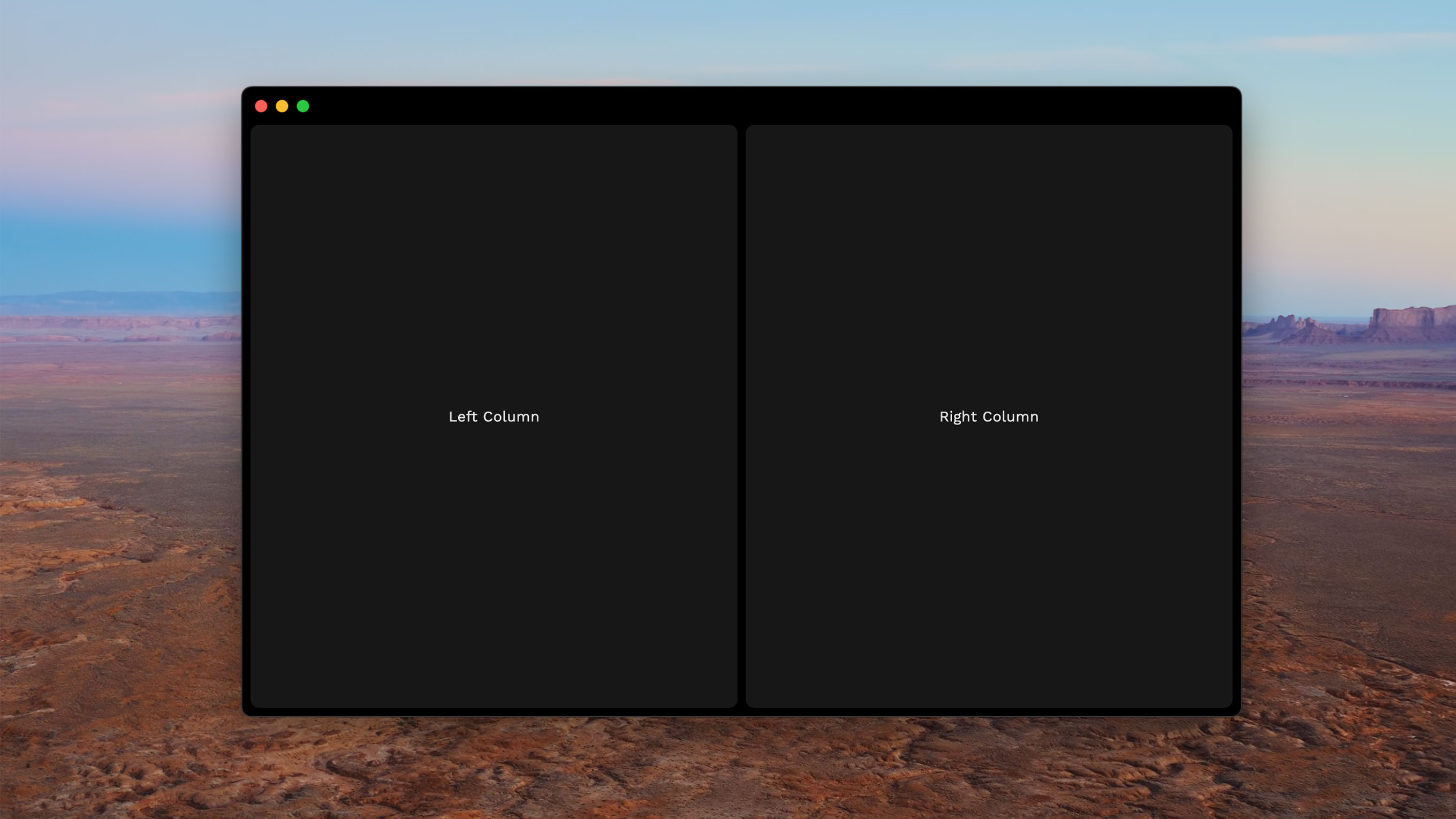
This week I took a deep dive into Flutter — specifically, using it to design a dark-themed desktop app. I started with the basics: a two-column layout and a black background. Nothing too wild... until I started noticing all the little things.
And if you know me, you know I notice things.
First up: the window bar. Flutter defaults to a gray macOS title bar — not ideal when you’re trying to channel your inner Spotify. Naturally, I dove headfirst into customizing it. (Because why build the UI before battling the OS?)
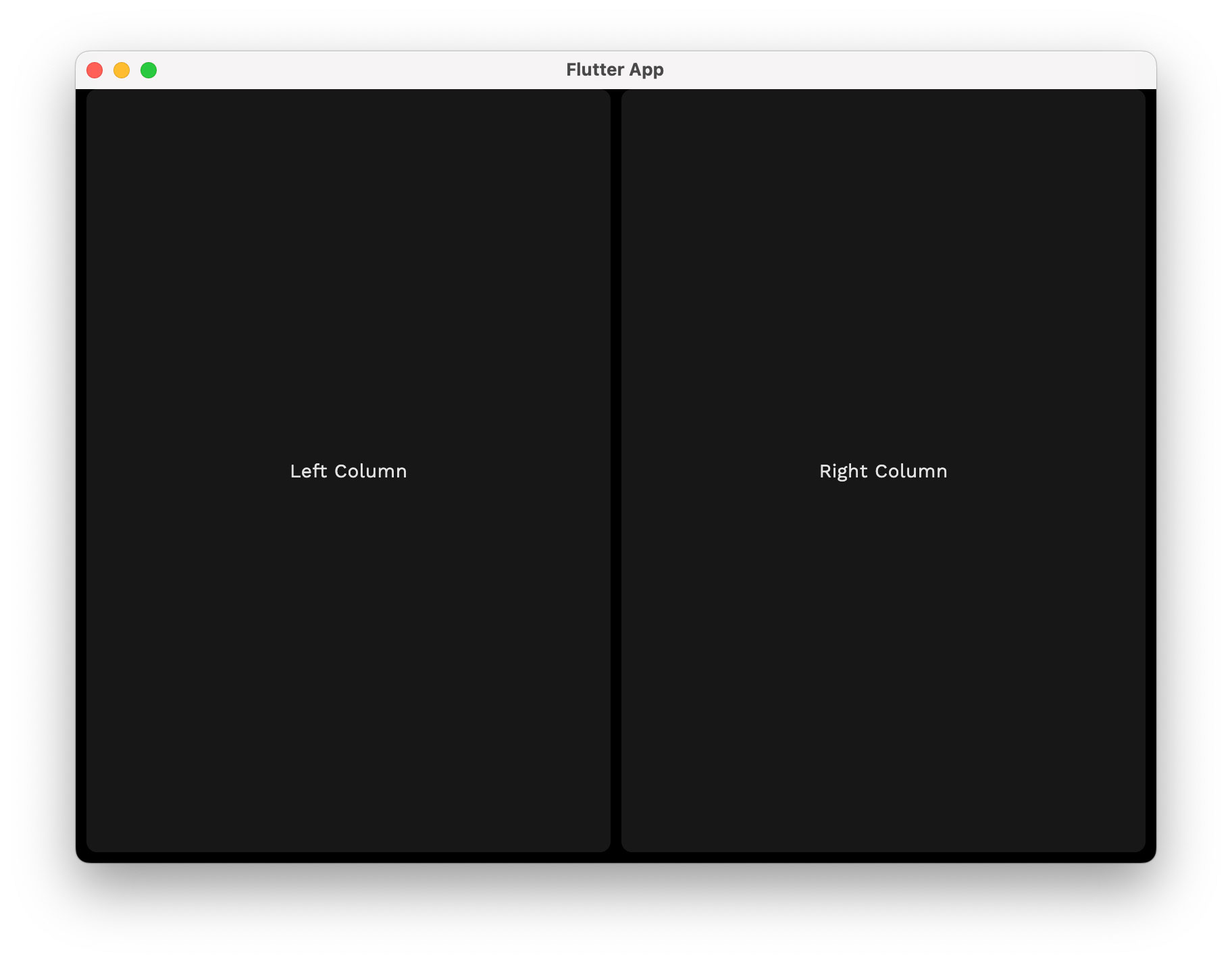
I started messing around with bitsdojo_window and all kinds of workarounds… only to discover that Xcode — yes, good old Xcode — had exactly what I needed all along. A few toggles later, and boom: a transparent title bar, no title text, and a properly dark canvas.
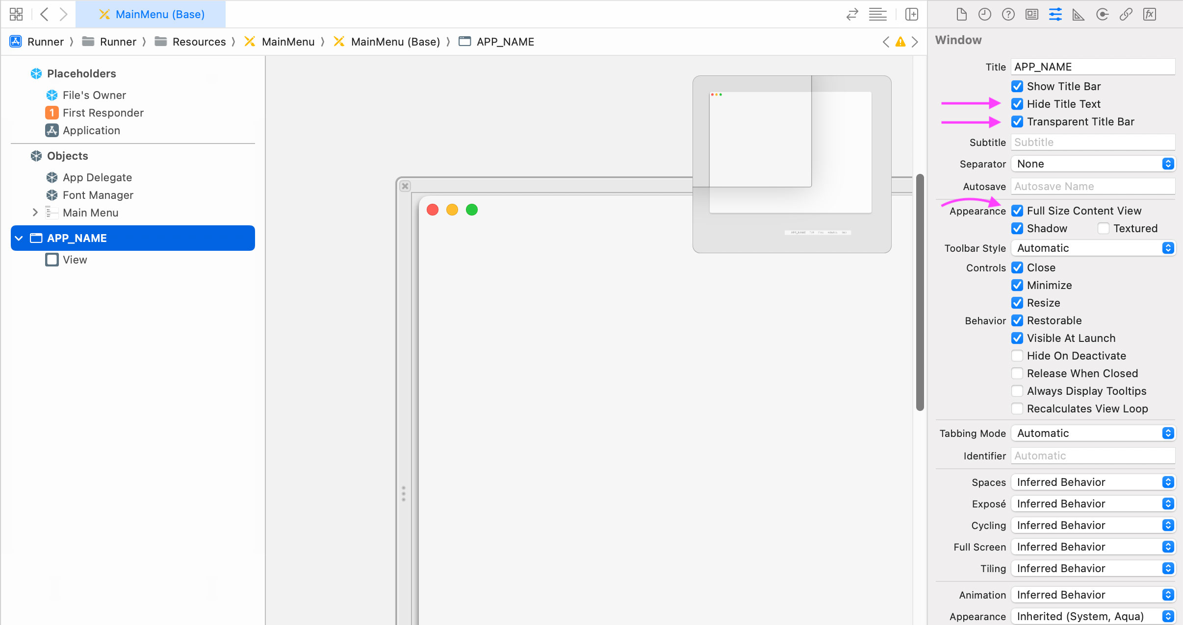
With that handled, I turned my attention to the finer things — namely, the macOS “stoplight” buttons. They were way too close to the top of the window, like they were afraid of heights. And then there was the glow: an invisible highlight on the top edge that only shows up against other dark windows. Subtle, but real. (Don’t worry, I zoomed in with Photoshop to confirm I wasn’t hallucinating.)
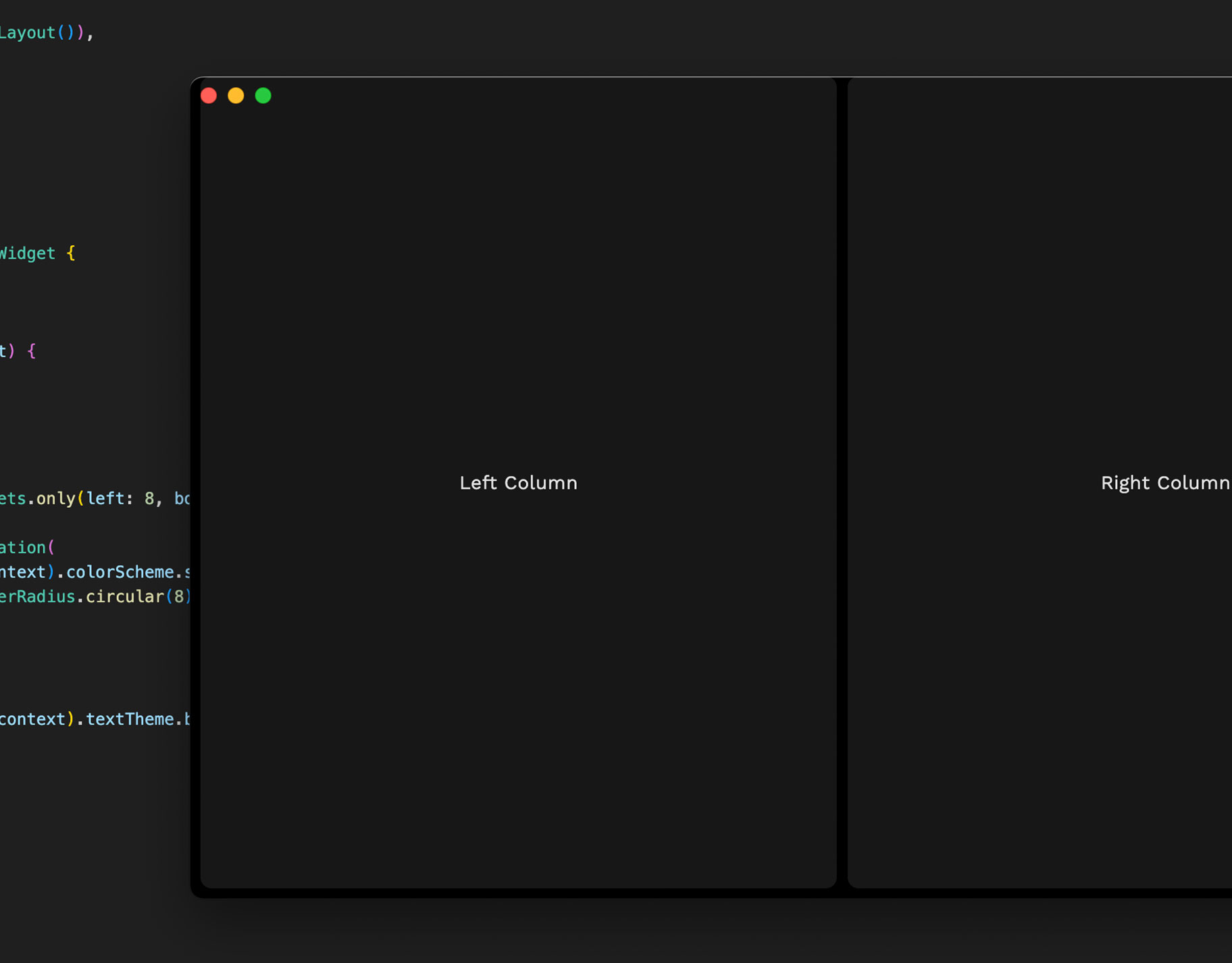
I wrangled that glow, added a clean 1px #333333 border, and even managed to sneak in a bit of breathing room above the window buttons. Now we were finally getting somewhere — something that actually looked shippable.
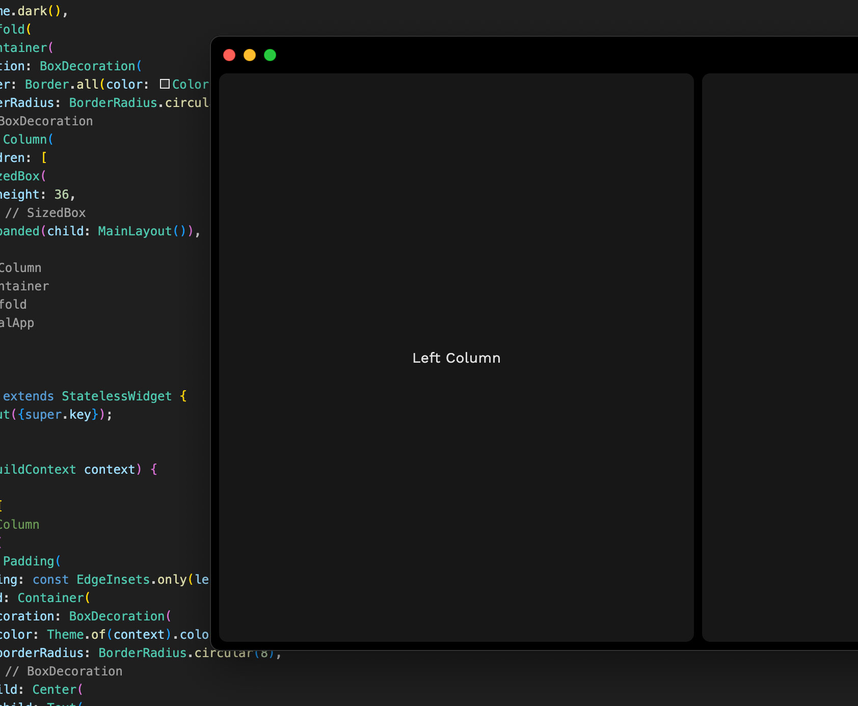
Because size matters
In a perfect world, I’d have a beautiful 64px tall header with the stoplight buttons centered vertically like they are in the Spotify app. In Flutter, though? Not so simple. I got the height dialed in — but the buttons stayed stubbornly pinned to the top, clinging on like they’d been raised in fear of padding.
For now, I’ve settled for “good enough.” The spacing makes it feel less claustrophobic, and after a long day of wrestling with macOS chrome and near invisible highlights... I’ll take it.
Sidebar: I’m starting to wonder if I’d have more control with Electron. (Yes, I said it.)
Next up: testing Flutter on Windows. I’m bracing for some surprises. But honestly, I’m curious to see how far it can go — and whether it’s a framework worth betting on for desktop UI work.
So far? It’s been weird, frustrating, and surprisingly fun.