
An expert in digital strategy, Jeff brings meticulous energy to the creative world through intentional design that works as well as it plays out on the screen. Intuitive form and function are his trademarks, finely honed through twenty years spent designing digital experiences that connect and inspire.
Big companies rebrand all the time, and most of the time people don’t even notice — and sometimes even welcome it. So what made this different?
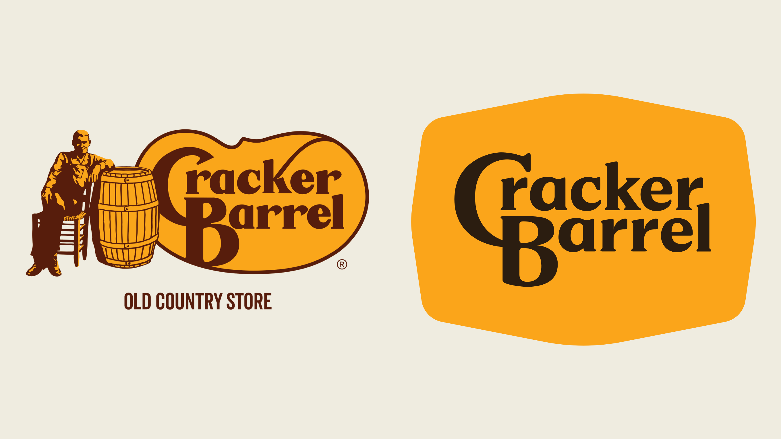
The power of brand equity
Logos aren’t just design. They’re memories.
Over time, people develop an attachment to a brand, both good and bad. Their experiences with a company attach to the visuals, and whether you like it or not, the Cracker Barrel brand is very memorable.
Especially with brands that have been around for a while, nostalgia becomes a big factor in what we call brand equity.
This is both good and bad news.
It’s good because your brand equity makes you recognizable and trusted. It’s bad because if you ever want to change your logo, you could be messing with people’s nostalgia.
An alienated audience
Most Cracker Barrel customers that I know are 60 and older, so it makes sense if they were wanting to reach younger customers. But in doing so, they clearly misunderstood how this would impact their business.
I wonder if this could've all been avoided by simply listening or getting feedback?
For a change this substantial, it seems any standard user testing before a larger rollout would have revealed the issue.
Here’s how I’d roll it out
I’ve actually never been a fan of the old Cracker Barrel logo — maybe that’s why I don’t eat there (or maybe it’s the heavy Southern food).
From a design perspective, the biggest challenge with the logo is the detailed illustration doesn’t scale well, especially on small digital screens.
As a designer, I’d love to see this brand evolve and improve. But a drastic change wasn’t the place to start.
If the goal was to attract a younger audience, the smarter move would have been to shift perception through the experience — healthier menu options (say, going seed-oil free), updated interiors, small cultural signals.
Brand equity isn’t stationary; it evolves. Over time, the existing logo could have inherited that new meaning.
Then, once people had embraced the new experience, a refreshed logo might have been welcomed. Roll it out in phases. Test. Revise. Build trust.
When a mark has lived in people’s lives for decades, these changes weren’t just design — they were disruption.