Vanderbilt Bone & Joint

Strategy, Design, Content, Development, Management

Year: 2015—2019

Client: Vanderbilt University Medical Center

Vanderbilt Bone & Joint

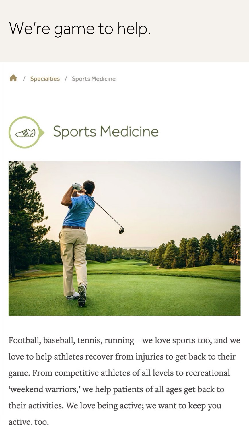
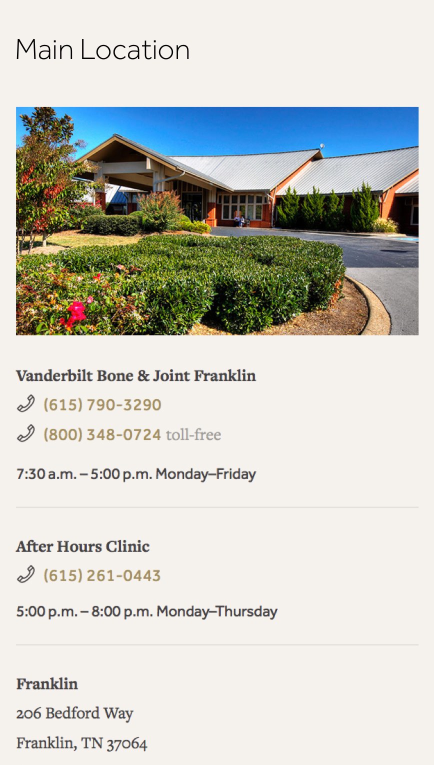
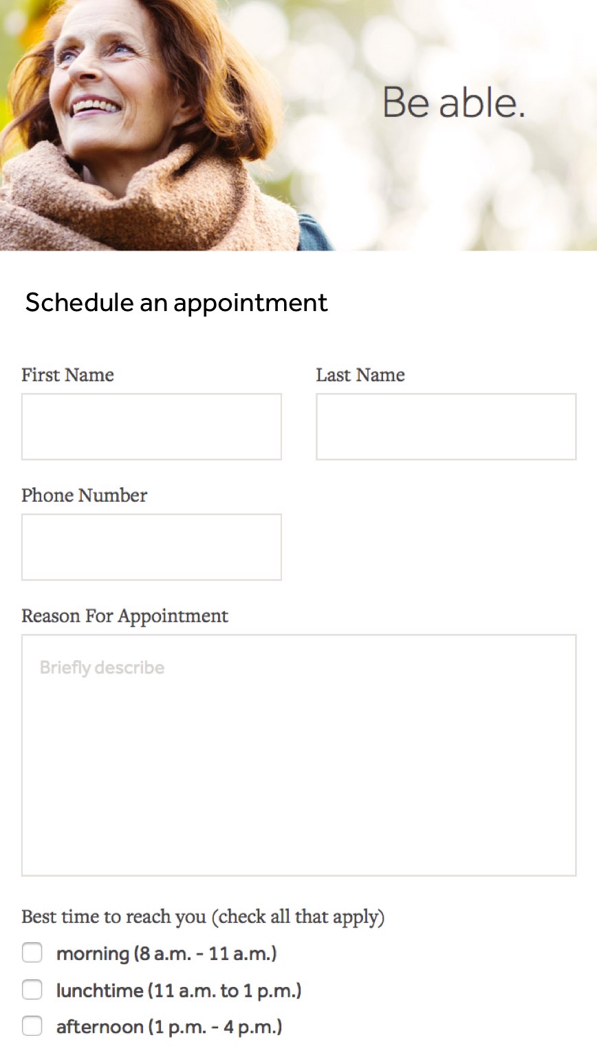
For a business focused on keeping people moving, the lack of a smooth web presence was slowing them down when it came to connecting with their patients. With a focus on ease of use, we created a welcoming new site for Vanderbilt Bone and Joint that showcased their specialties and made it easy to request an appointment or find information.

Just what the doctor ordered. Maybe a tad bit more.

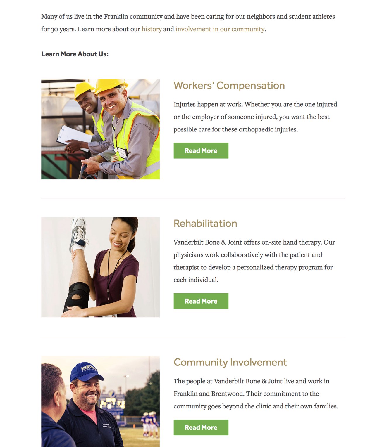
Vanderbilt Bone & Joint website design

01 Designing for the personal connection

For the longest time, the only way patients found clinic information was through vanderbilthealth.com, the massive site for the well-known Vanderbilt University Medical Center. Despite the superior orthopedic care they gave, the online structure made it hard to find resources or make appointments. We also wanted to play up their commitment to community involvement, positioning it as a personal, family-oriented clinic, a trickier move considering the size and depth of its namesake program.
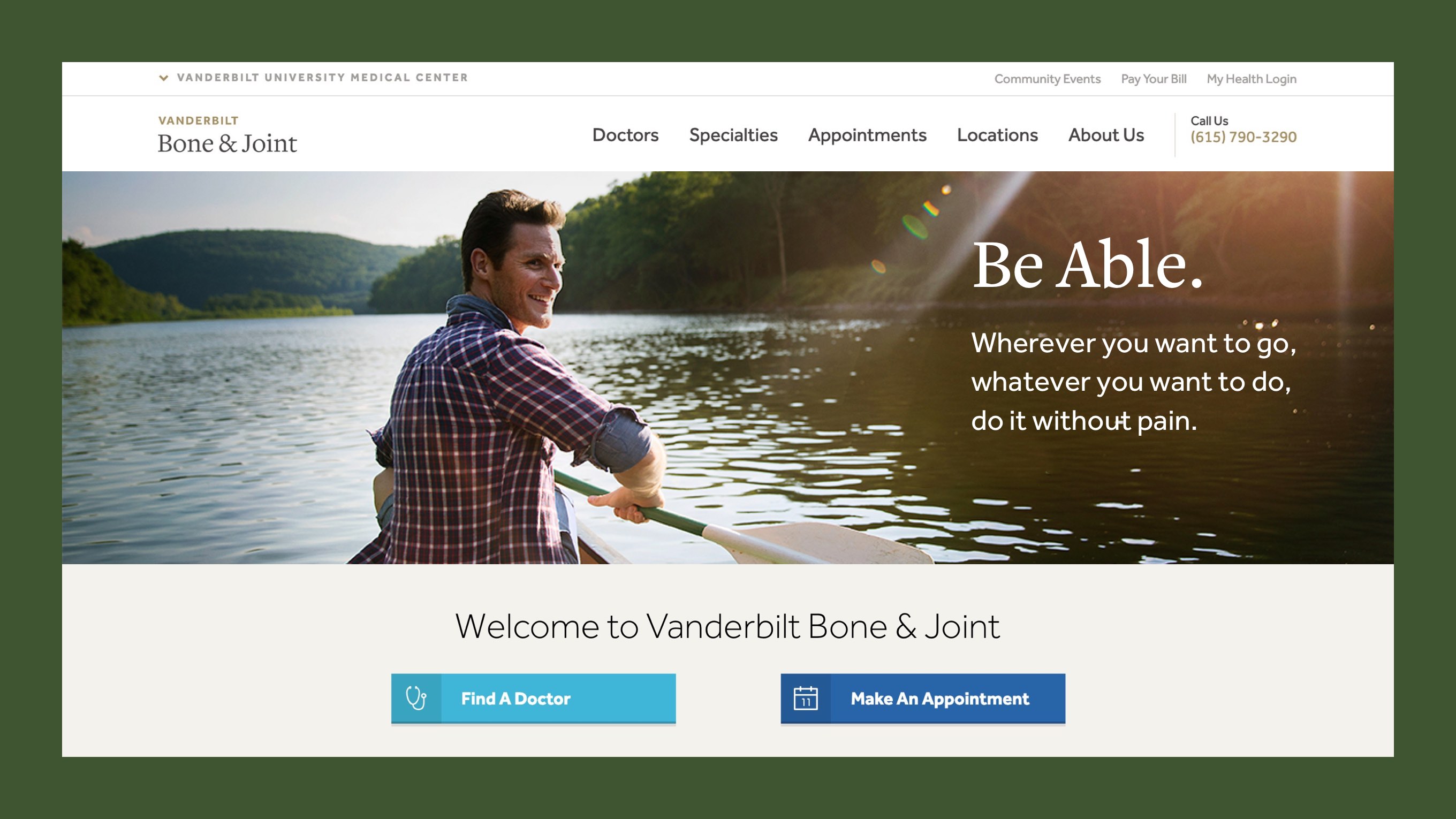
Vanderbilt Bone & Joint
Vanderbilt Bone & Joint website

02 Visual identity and content strategy

To start, we created a color-coded content map, a visual hierarchy that connected to our goals and objectives for each page. This informed every design decision, from how we would appeal to a larger, more age-varied demographics to where we would provide doctor specific information that established the clinic’s credibility.

Vanderbilt Bone & Joint mobile design

03 Using analytics to improve user experience

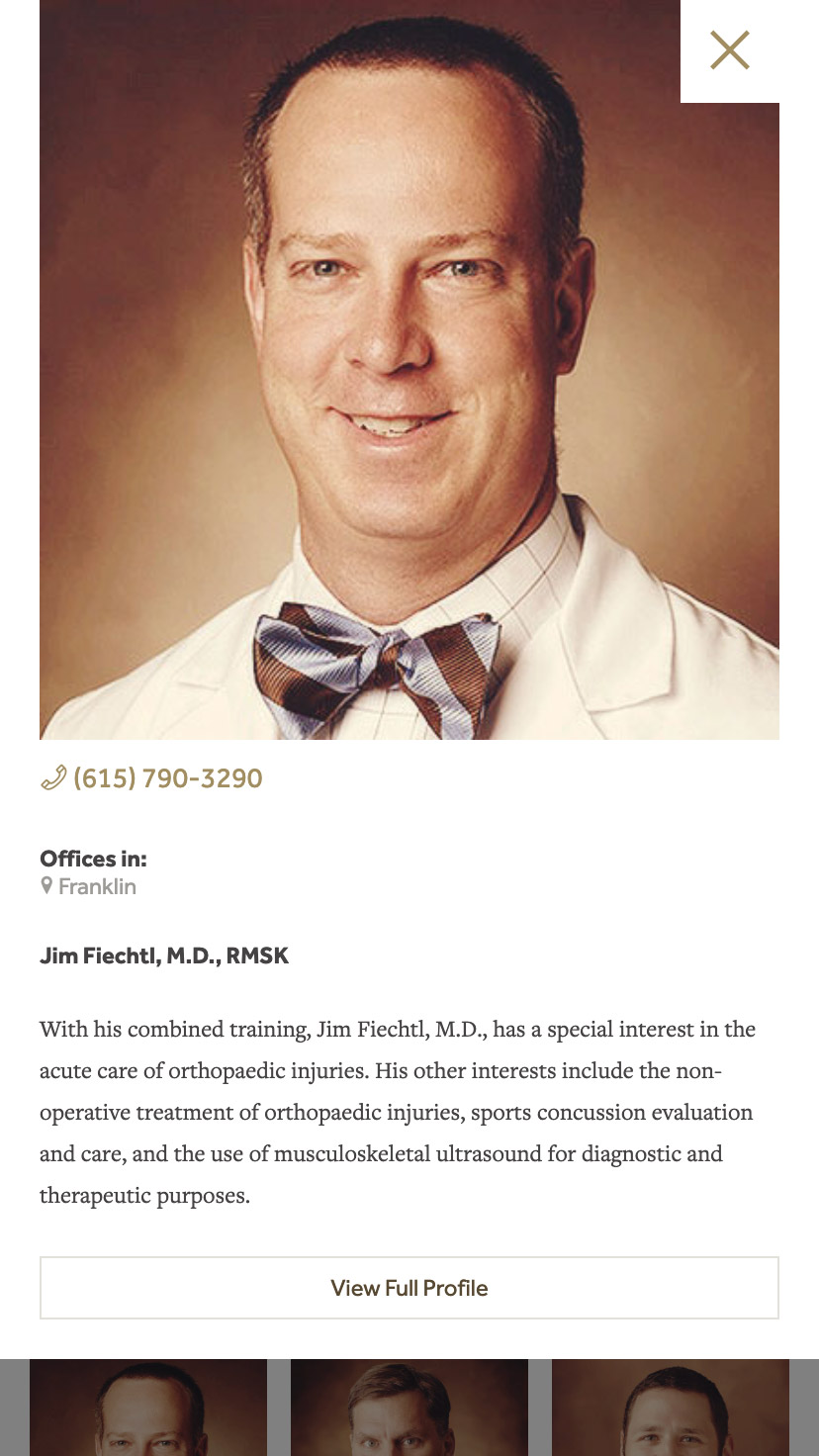
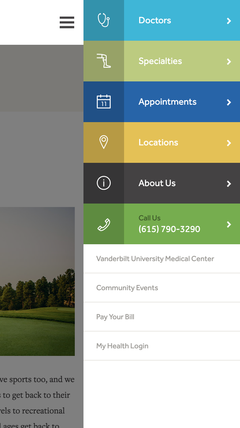
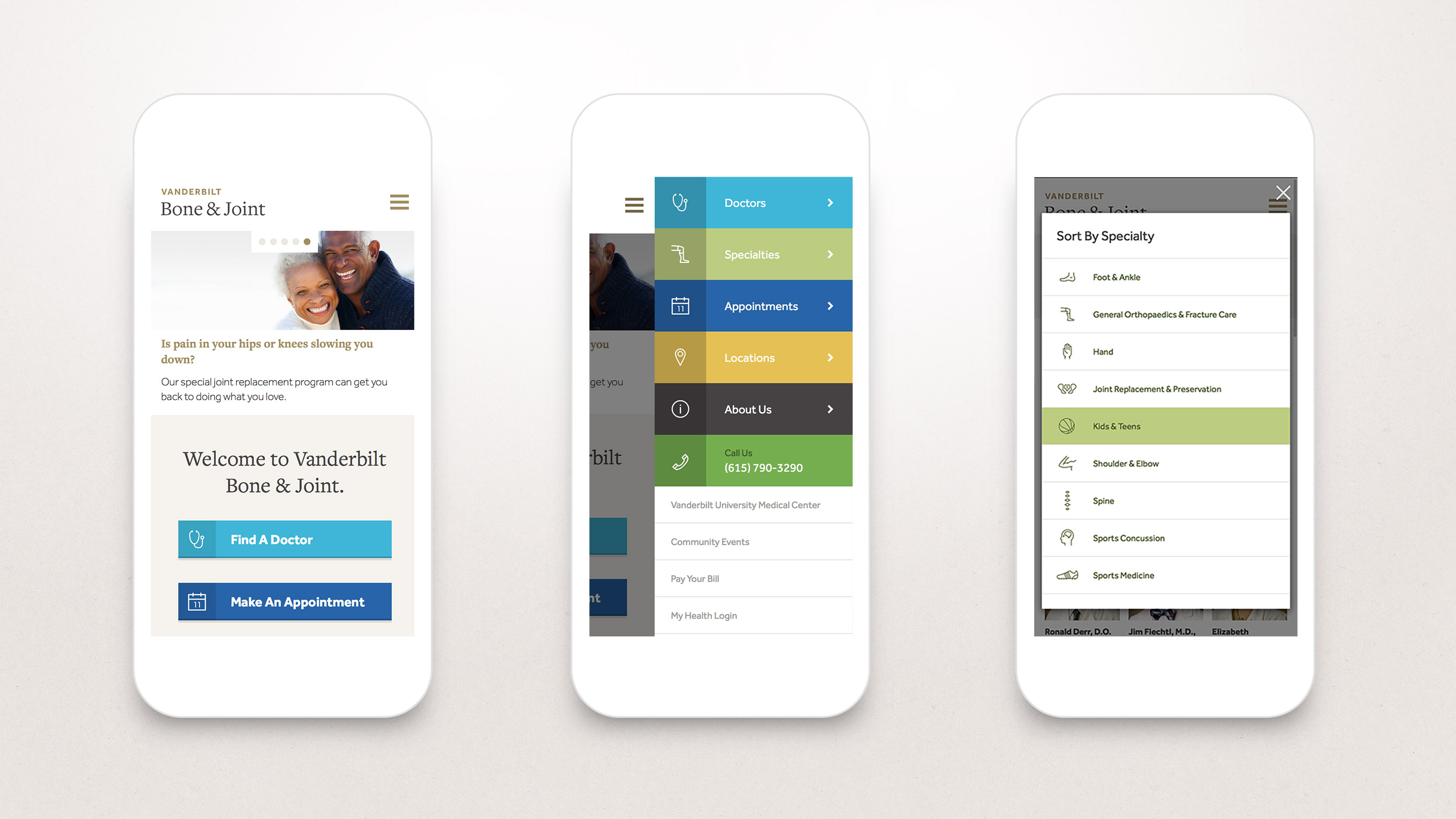
The goal-defined structure led to clear and concise navigation, with unique icons that called attention to different specialties and combine with the text to make the content easy to understand. The design relies on multiple layouts and configurations for the landing pages, with a built-in analytics-tracking feature. We also created a quick-view window for patients to browse doctors’ biographical info, a move that upped the clinic’s credibility by presenting its medical team as experts in their field. The overall feel is welcoming; the site is professional yet approachable, and gives its users a sense of community that translates easily to mobile devices.

Vanderbilt Bone & Joint mobile design

Services

  • Visual Identity
  • Content Strategy
  • Information Architecture
  • Web Design
  • Iconography/Illustration
  • Photography
  • Full-Stack Development
  • CMS Implementation
  • Brand Campaigns
  • Content Management
  • Ongoing Development
  • Analytics and Market Research
hand
Need a hand with your project?

Drop us a line. We don’t bite…

Contact