01 Visual identity
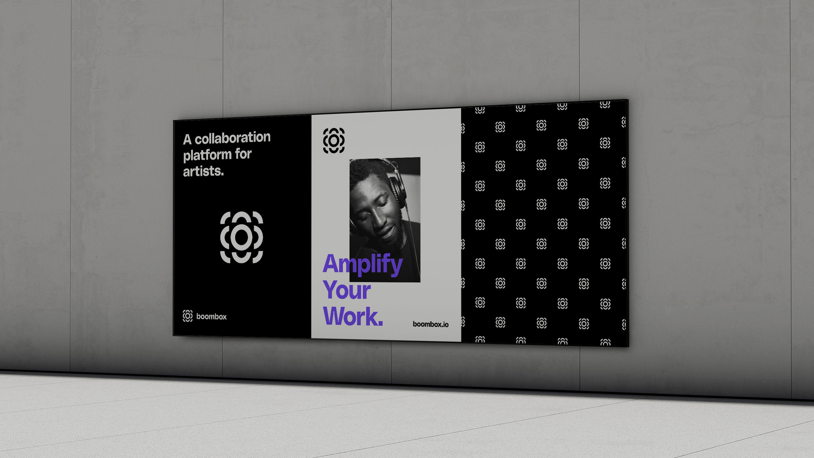
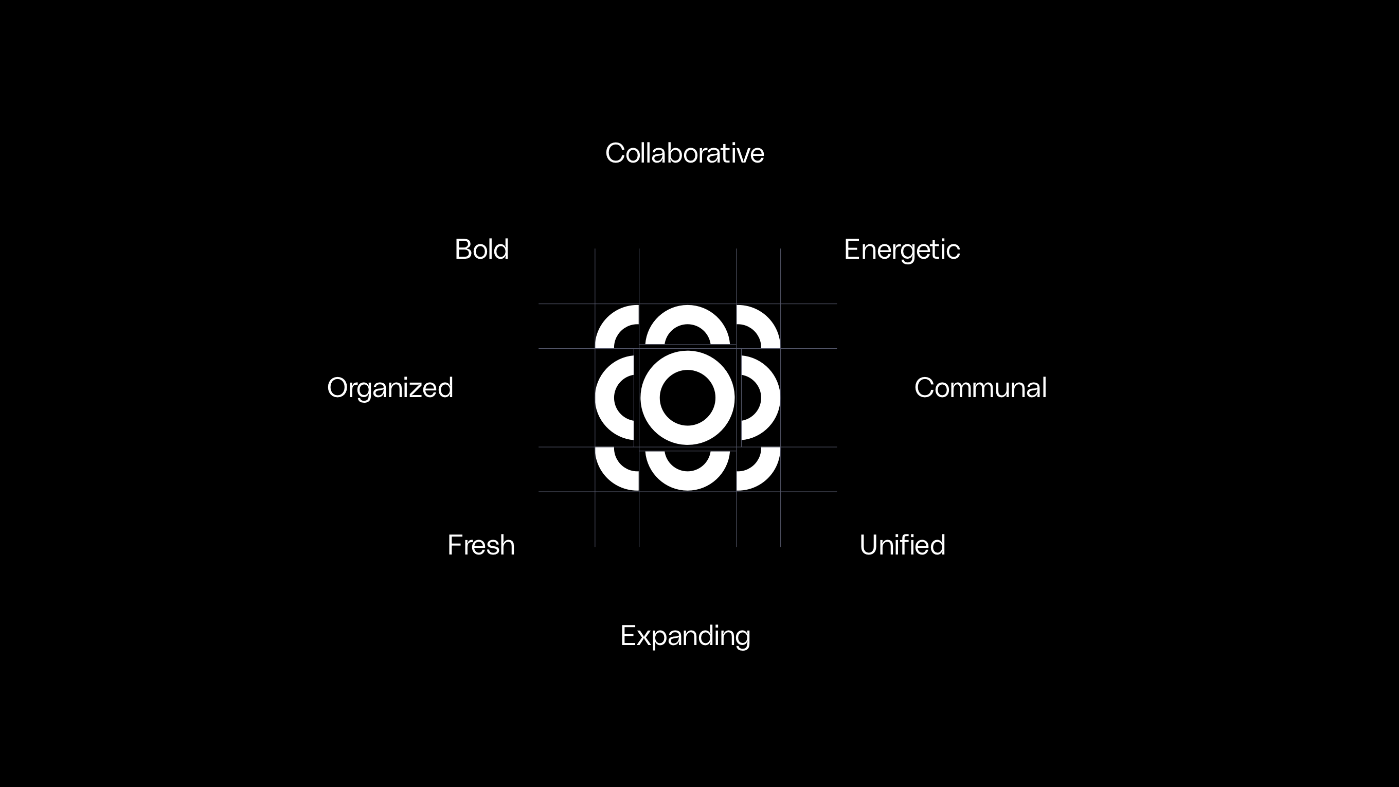
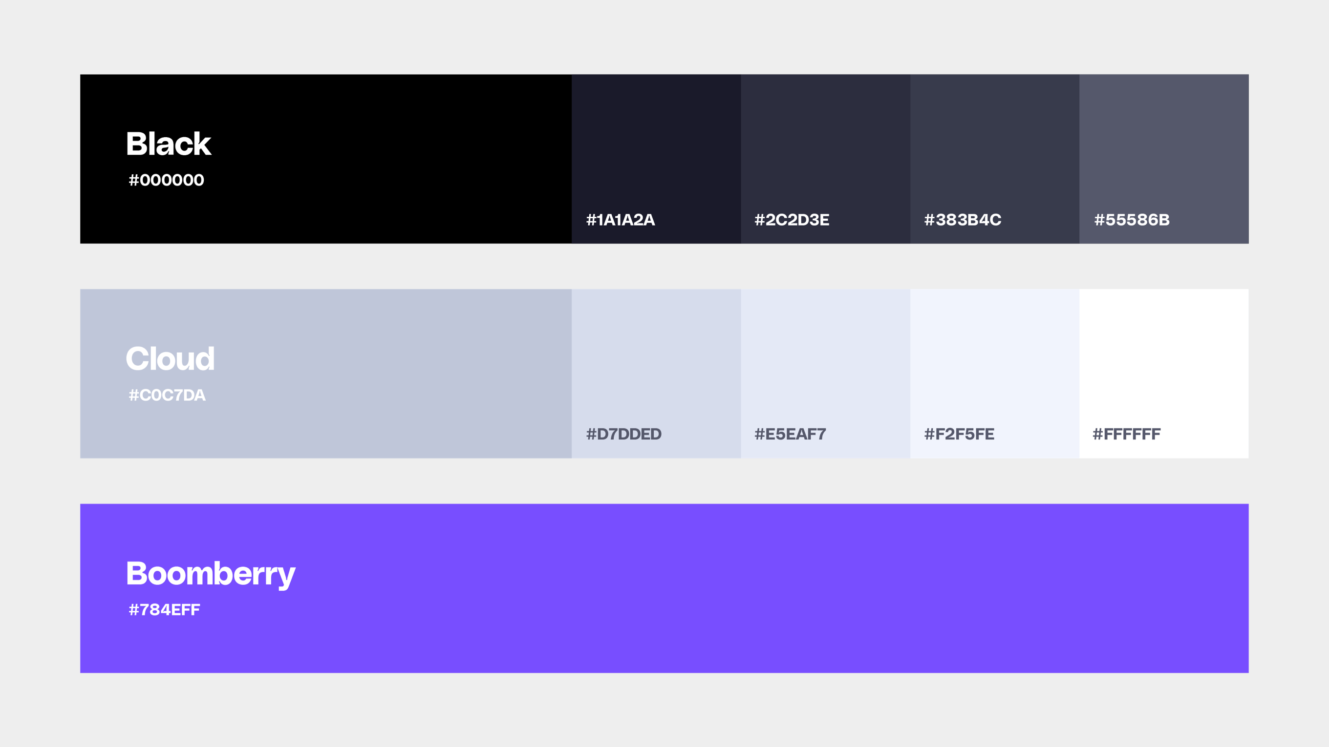
The brand is mostly classic black and white, with versions for light mode and dark mode. Bold pops of “Boomberry” give it punch when needed, along with an extended color palette to allow expression in user profile avatars.
Year: 2022—2024
Boombox is a music collaboration platform that allows songwriters and producers to share files, add comments and voice memos, and manage song splits. We jumped at the opportunity to design their brand, website, and app, given the fact that we are the target demographic.

The brand is mostly classic black and white, with versions for light mode and dark mode. Bold pops of “Boomberry” give it punch when needed, along with an extended color palette to allow expression in user profile avatars.
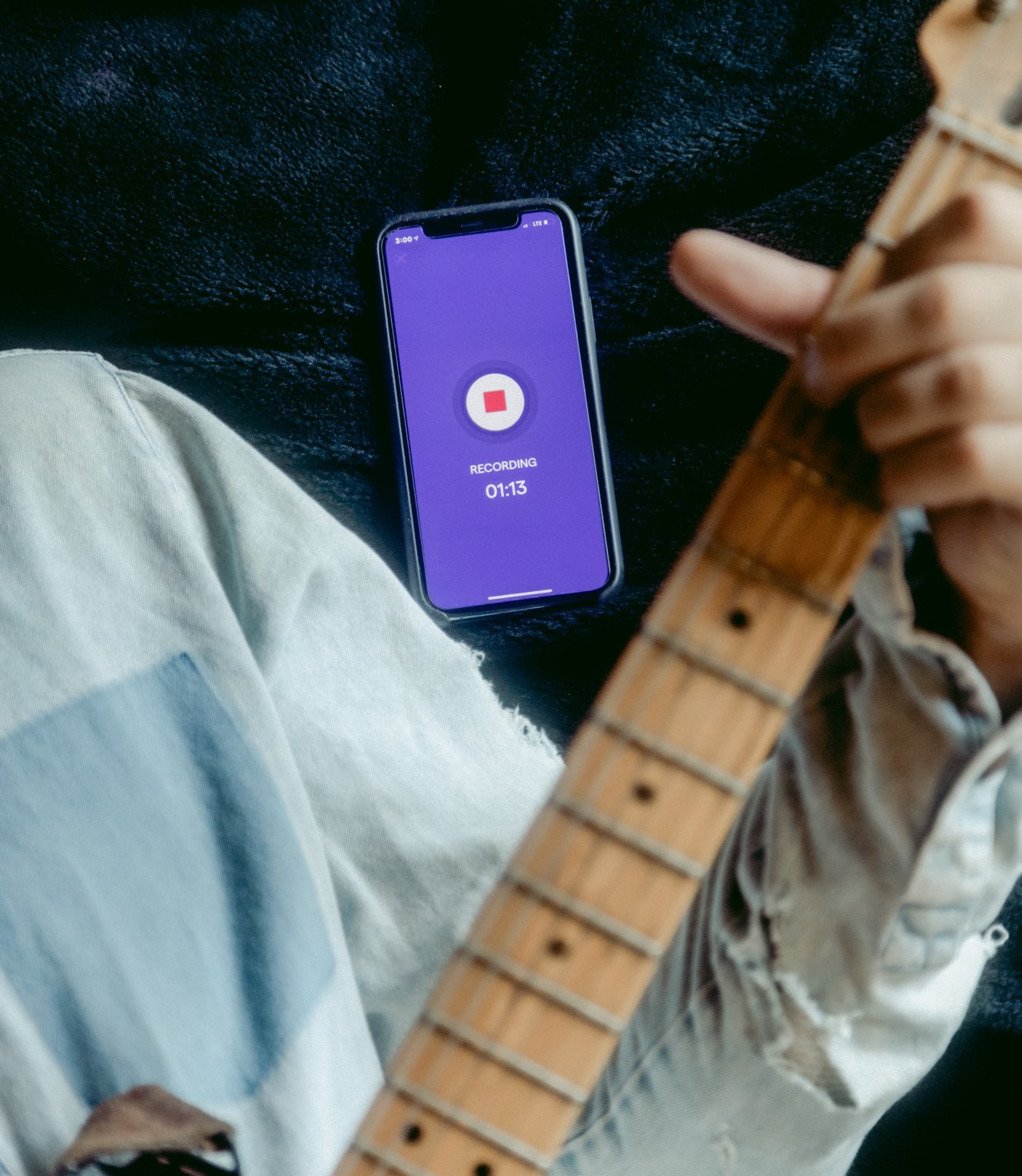
Creatives are used to juggling many different hats, both in their creative process and life. Boombox is flipping the script, with a platform that allows for less juggling and way more creating. We designed the app with that efficiency in mind, giving users powerful tools, free of distractions.
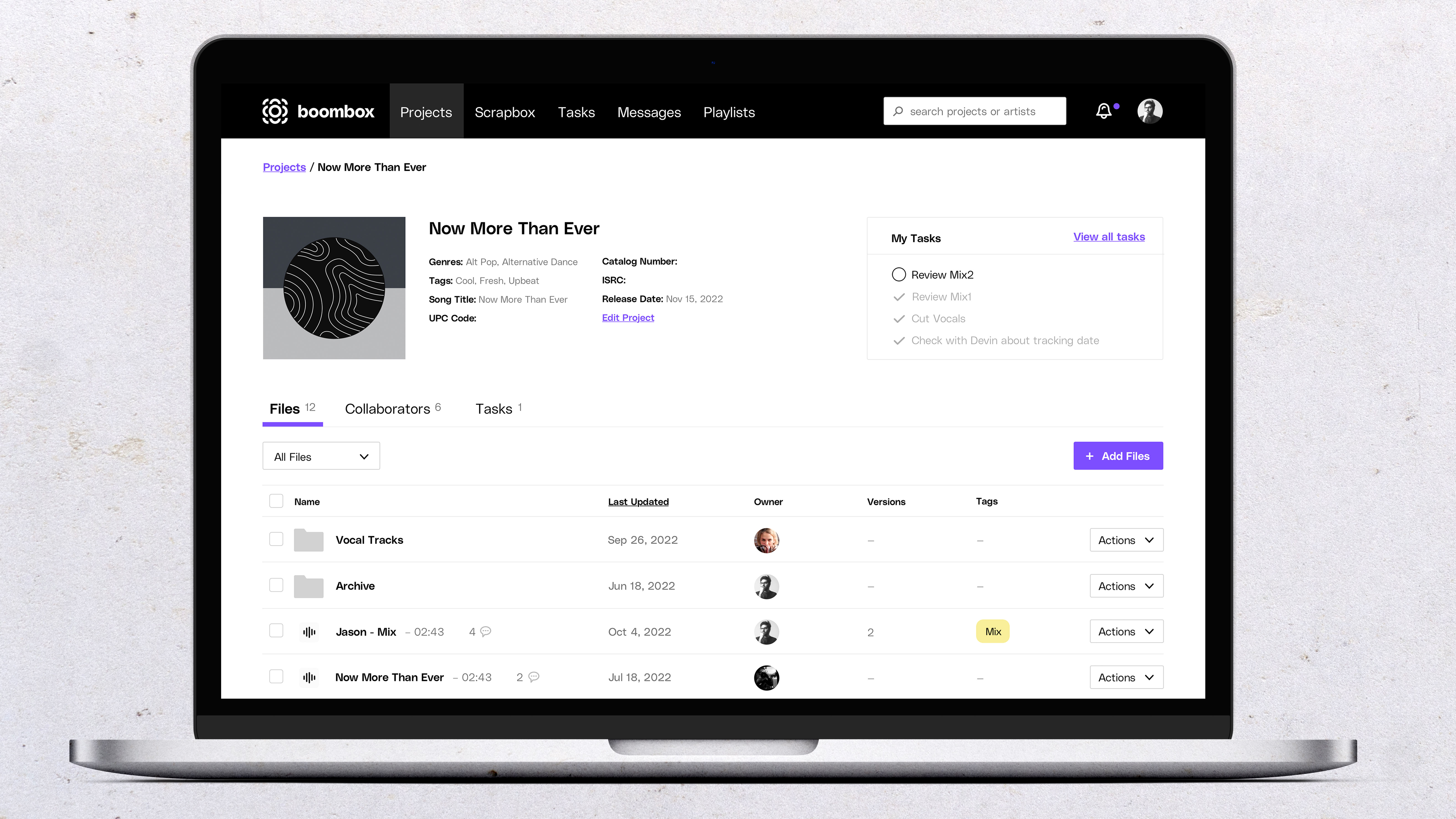
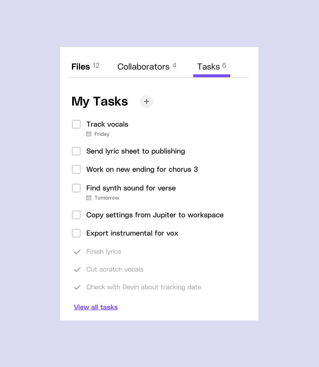
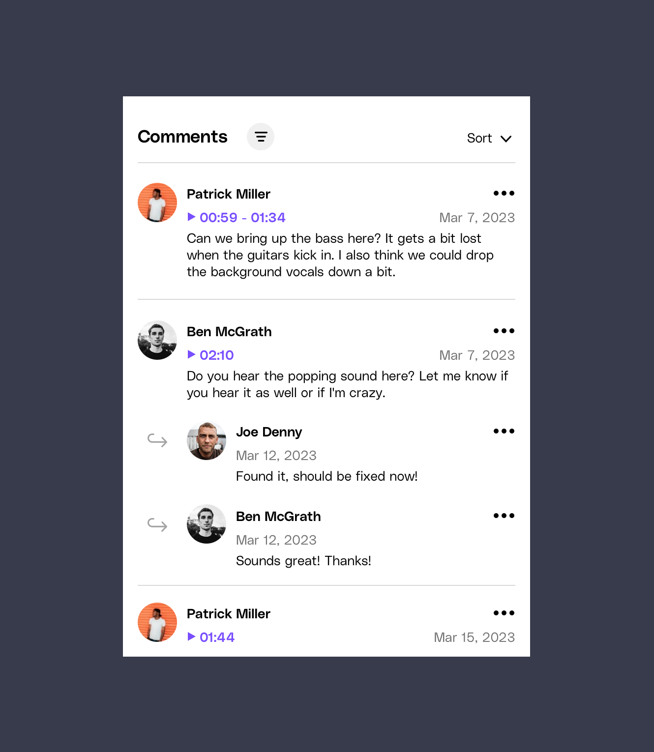

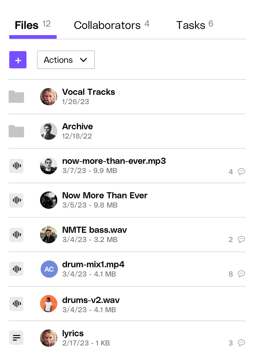
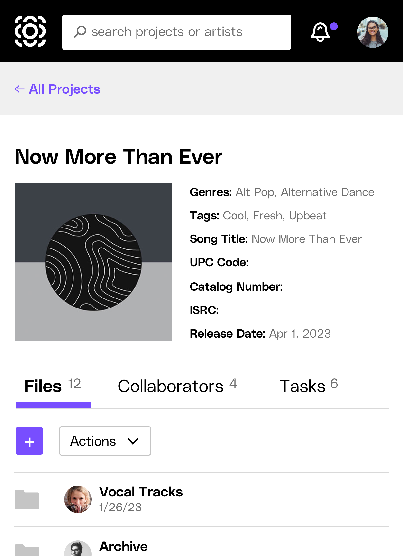
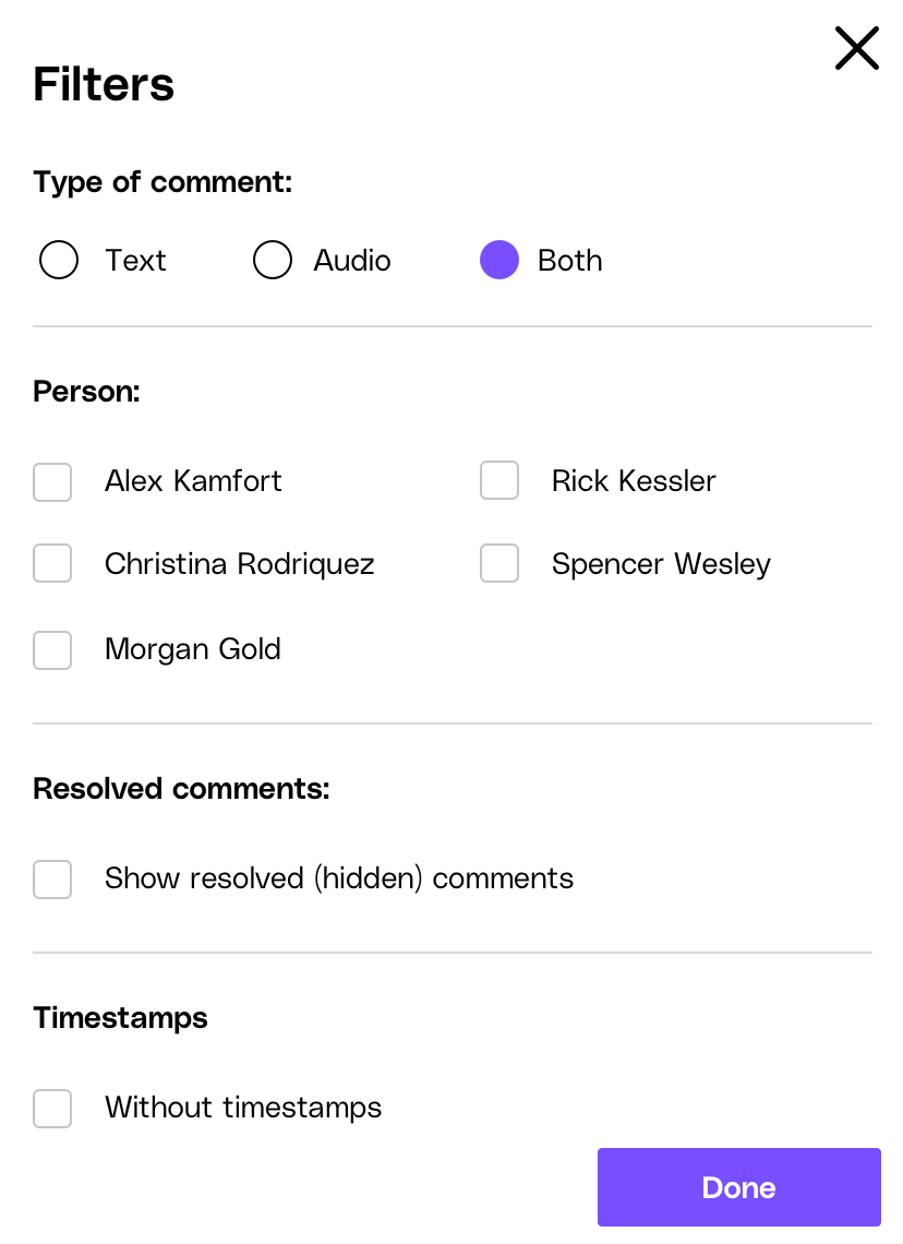
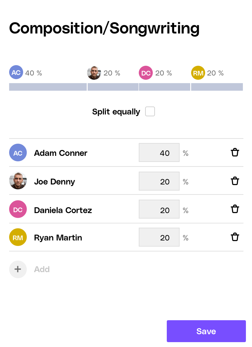
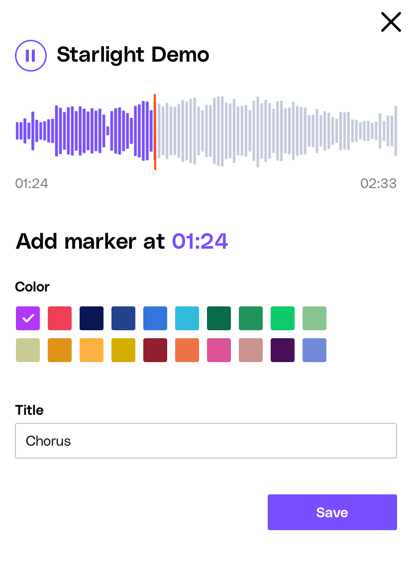
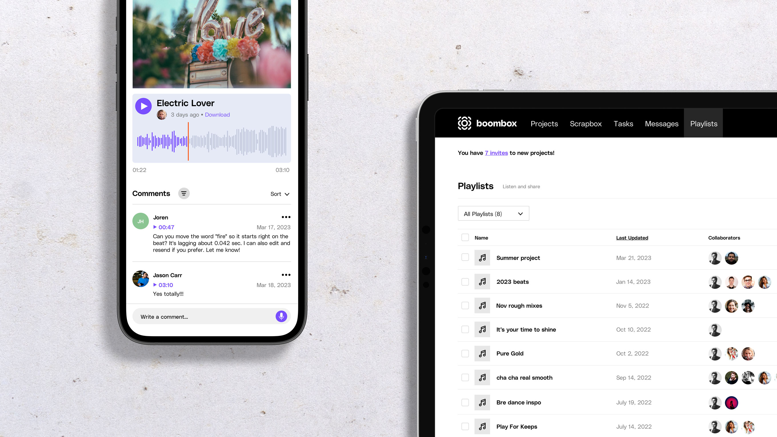
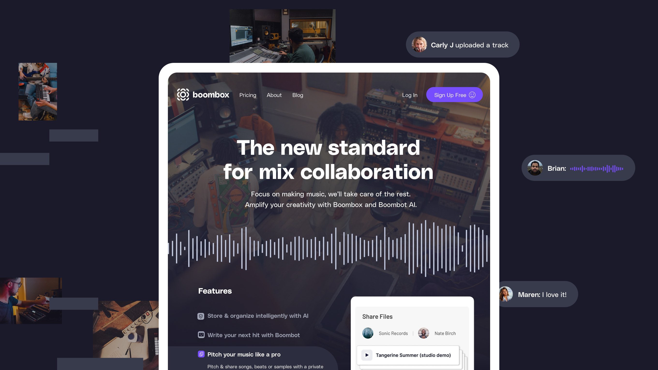
The echo of the app interface can be heard throughout the website design and functionality. With a simple scroll you know what Boombox is about and more importantly, how you can sign up (insert smiley face).
The pricing page reflects a consistent aesthetic paired with intentional copy, while the blog has a “no-nonsense” approach to content presentation, allowing the audience to engage quickly with the information they need.

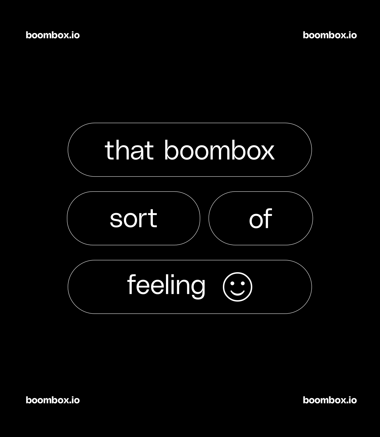
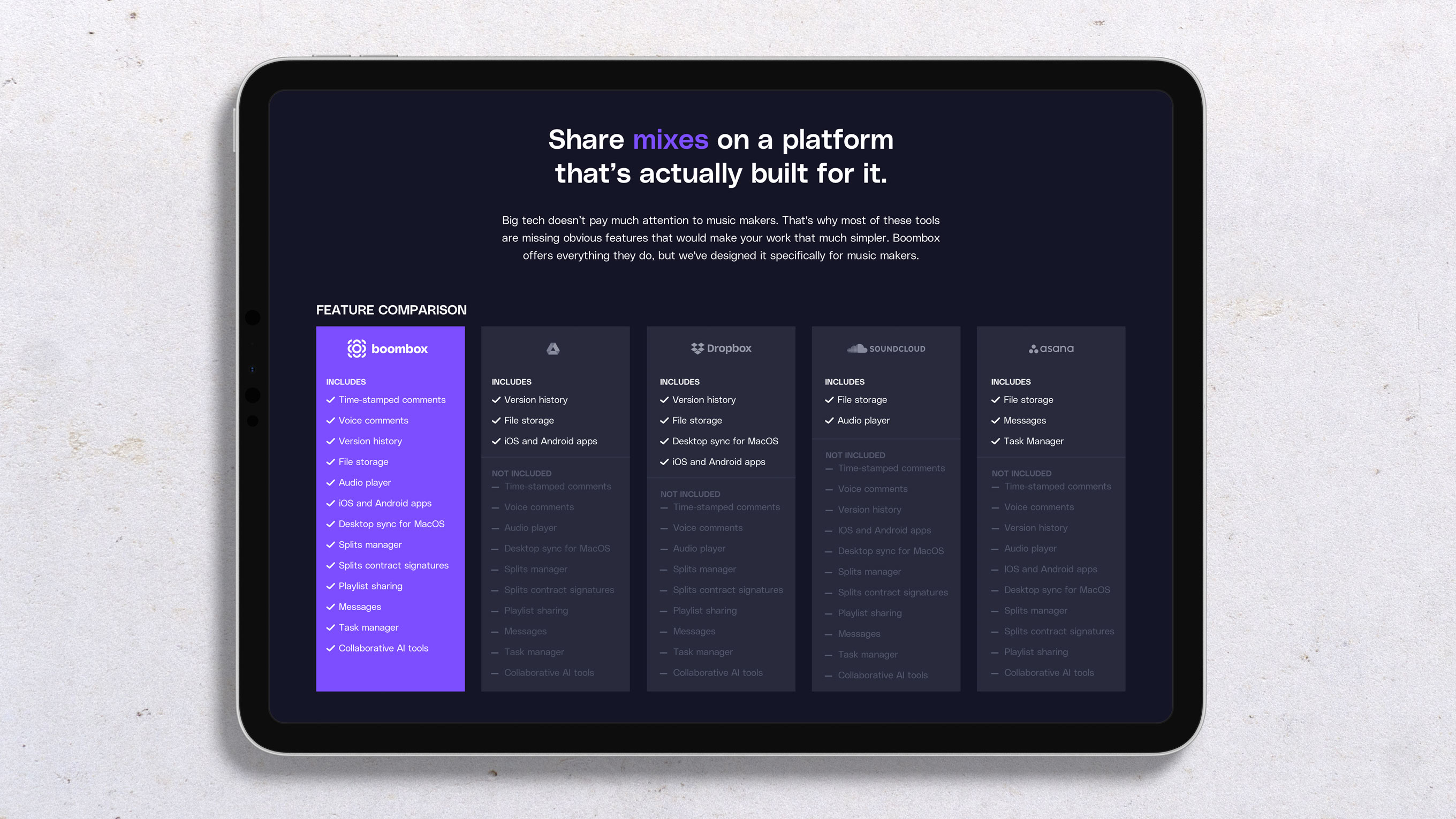
The result is a fun and approachable brand, introducing a game-changing tool for musicians.
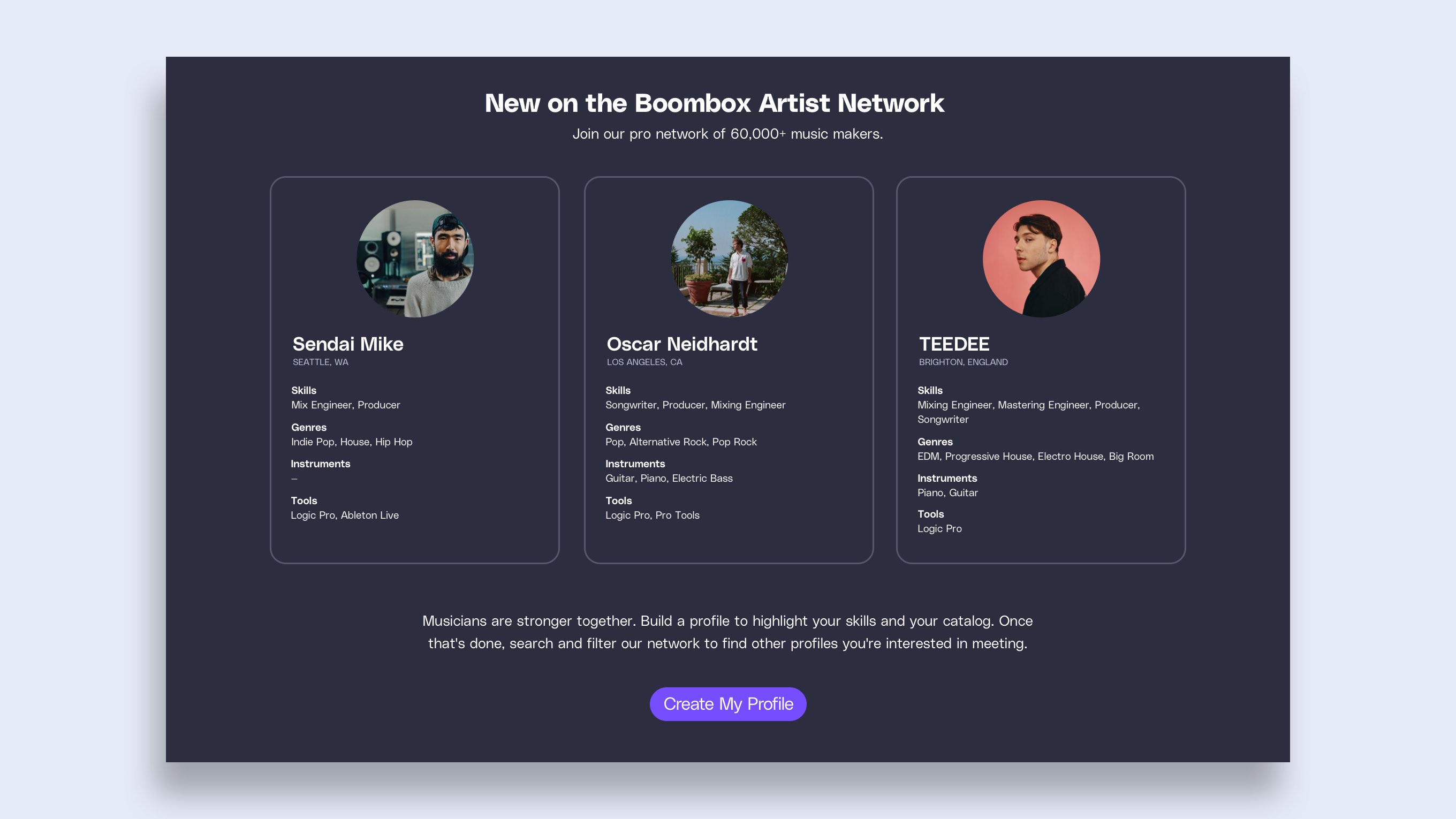
After spending many late nights and early mornings brainstorming how we could enhance music-making collaboration, hearing the praise from its users is music to our ears.
