Ned Davis Research

Year
2019
Work
Brand, Web Design

Overview

NDR is a team of codebreakers. And, breaking code takes genius. They stay a step ahead of the markets, and have proven techniques. They have established a rapport in their industry for being disciplined and deliberate in their research, key factors we wanted to emphasize in their messaging.

Along with the brand and web design, we created foundational templates and overall creative direction that helped establish a system for long-term brand integration.

Visit ndr.com

What we did

  • Visual Identity
  • Brand Guidelines
  • Iconography
  • UX/UI Design
  • Video/Animation
NDR logo before/after

01 — Discovery

We went through an extensive brand strategy process with the Ned Davis Research marketing team to establish clear milestones that would help differentiate NDR. Our challenge was to embrace the duality of a company known for trust, with the vision of being forward thinking with an eye on the future.

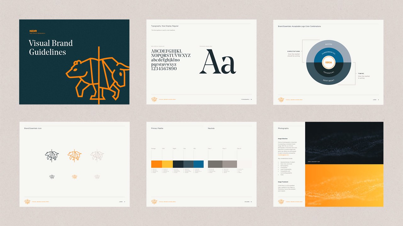
NDR visual brand guidelines

02 — Color

We put a lot of thought and intention in establishing a bold color that would be memorable, differentiate NDR from their competitors, and become a unique identifier to the brand. In addition, we developed a complimentary palette of warm, cool and neutral colors, as well as a flexible gradient palette to give NDR a very distinct look and personality.

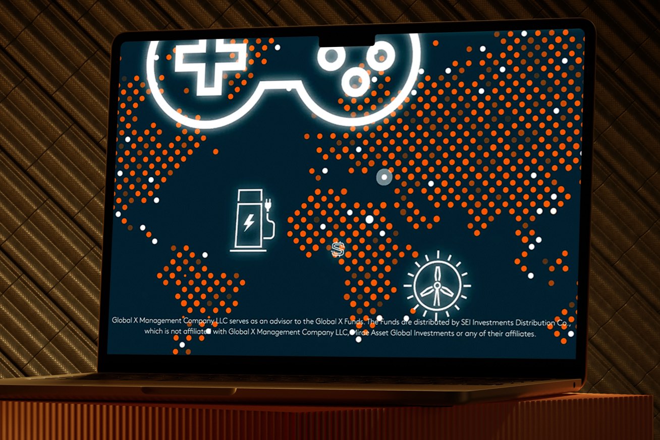
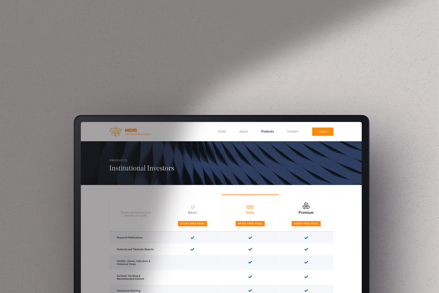
NDR website design
“We put a lot of thought and intention in establishing a bold color that would be memorable, differentiate NDR from their competitors.”
NDR website design
NDR website design

03 — Web Templates

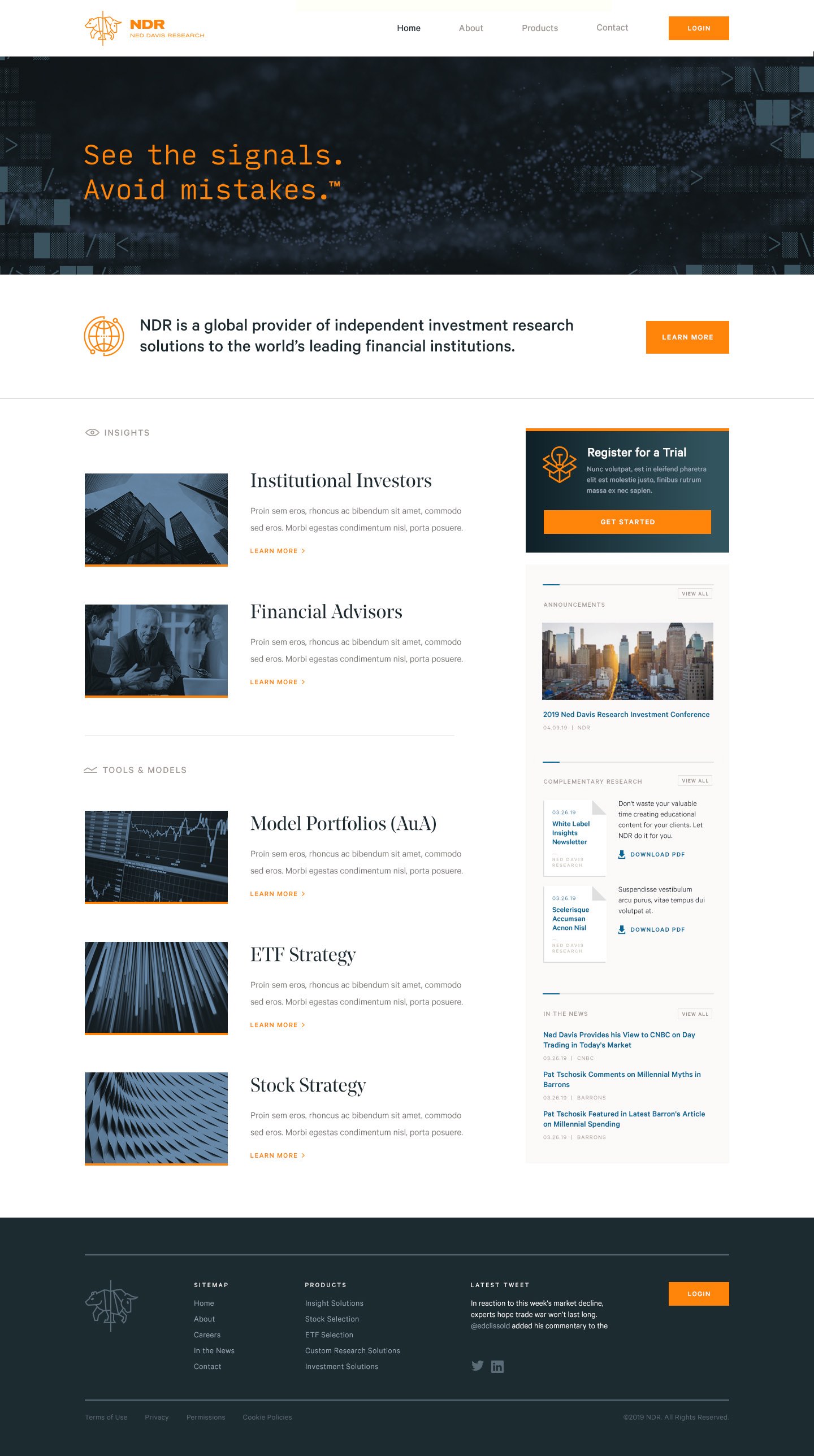
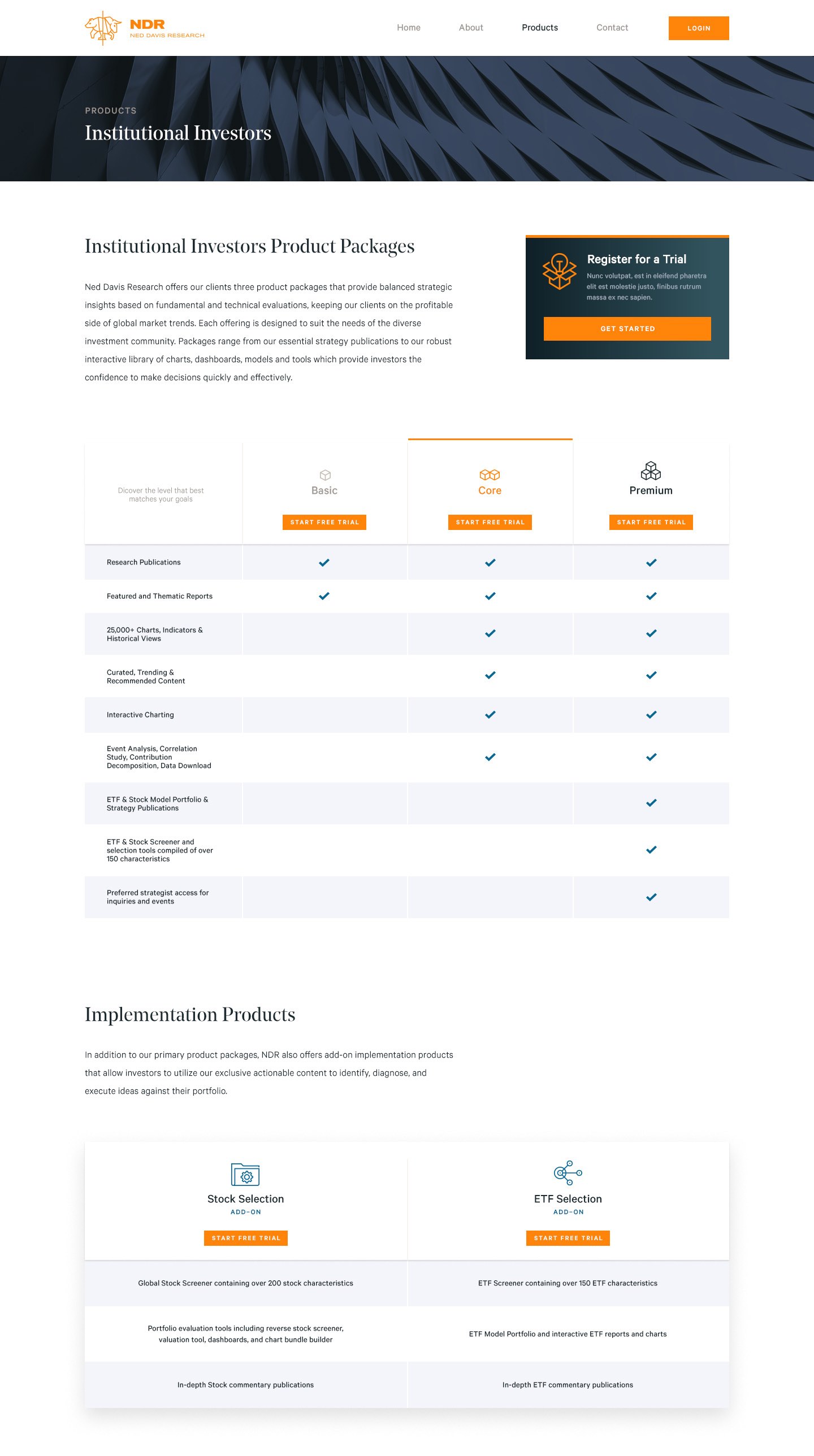
The website is carefully crafted to inform and empower the user–establishing brand trust quickly and ultimately compelling them to purchase. A modular system was designed for consistency across pages, allowing for various content types while maintaining a very clear hierarchy.

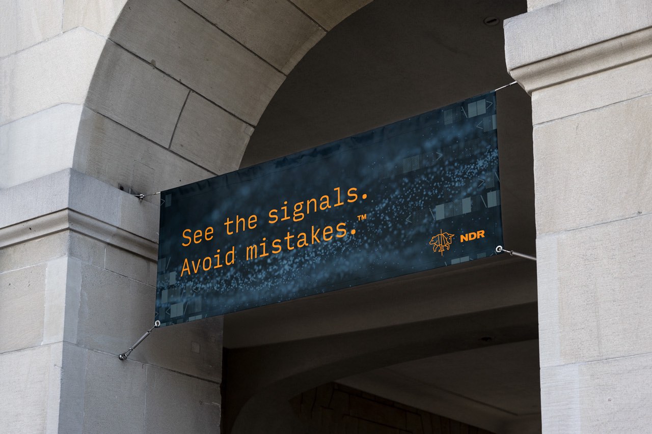
NDR tagline banner

04 — Code-breaker concept

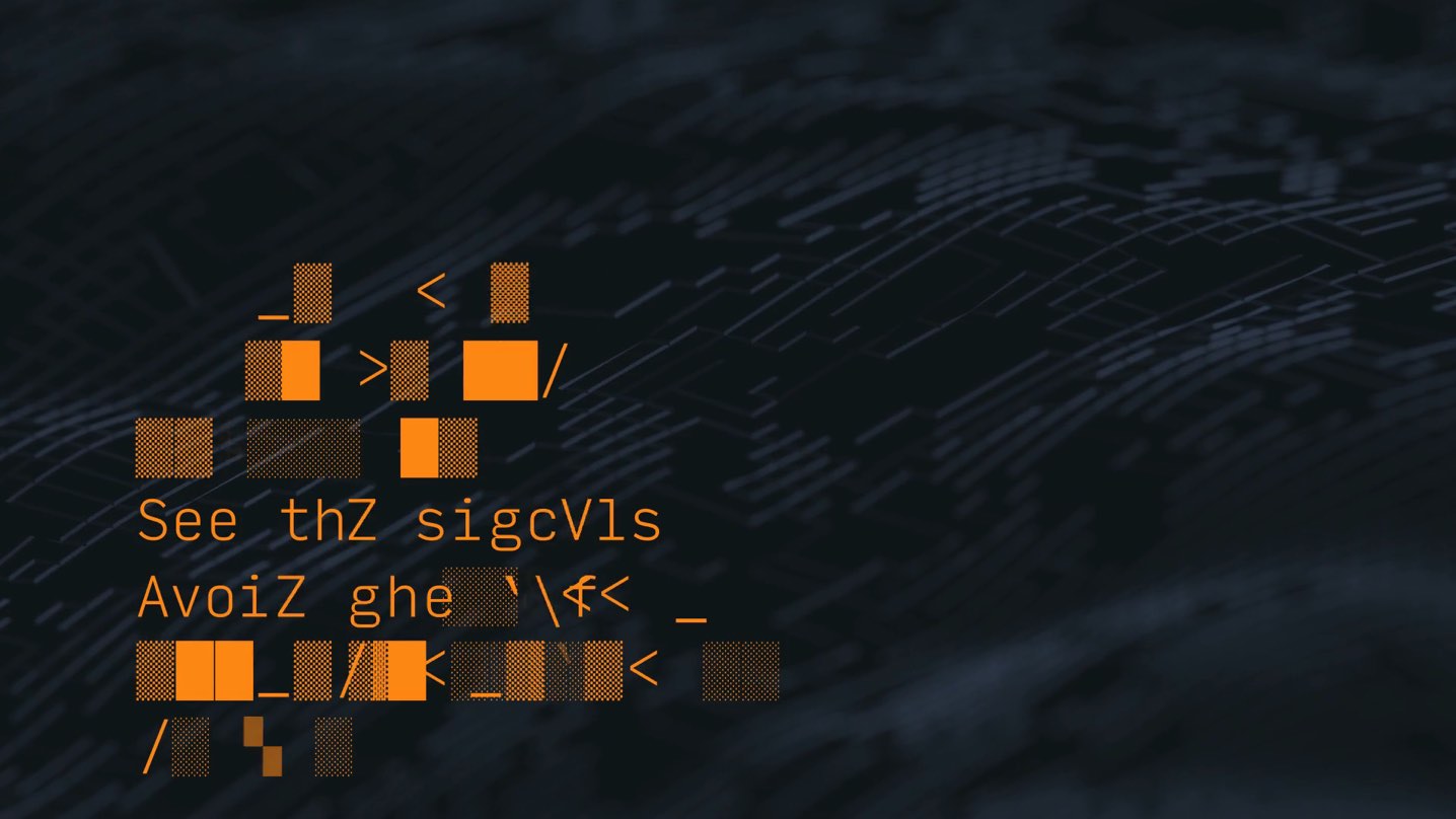
We proposed elevating the “See the signals. Avoid Mistakes.” tagline into a memorable marketing phrase.

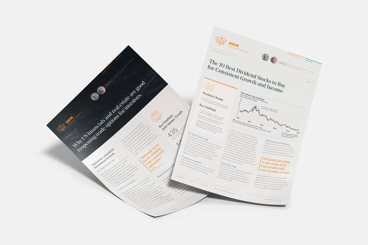
NDR templates for print

05 — Typography

We developed a system for three complimentary typefaces styles to aid in the NDR brand development, including (1) a clean, modern utility typeface that would be easy to digest, (2) an elegant serif typeface that would help establish trust and evoke tradition, and (3) a monospace, data-driven typeface that would showcase data beautifully, and boost the codebreaker concept. This system helped to keep the trustworthy, institutional feel, while simultaneously integrating the futuristic code-breaking concepts, as needed.

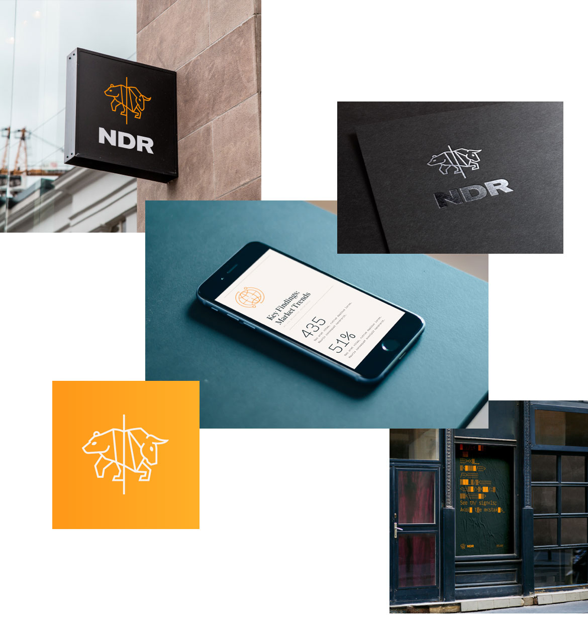
NDR logo usage examples

06 — Icon and Wordmark

Since they’re code-breakers, they have to look at data and decipher it. Our idea was to blend the bull/bear, but connect them in a unique way that symbolizes the inter-connectivity of data and information. We were mindful of scale and how it would translate—from a small thumbnail to a billboard.

The aim behind the custom typeset word mark was for it to be clean, and forward thinking, while also rooted in history to help establish trust. We utilized a century old typeface, that also aligned with classic Swiss design style of the 1950 and 60s. The mark is bold, and was designed to work well in all scales, which enables it to work as a standalone when isolated from the icon.
Need a hand with your project?

Drop us a line. We don’t bite…

Contact